Wordpress theme 2010 allows you to have animation in the header of your webpage which is pretty cool, but you have to know how to make an animation in a .gif format. I had a friend make one for my page, and now I started to make my own animations. I started my making several for my brothers webpage without asking him, put them on his web page, and then got his opinion.

He didn't really like this version of his new header, it's too flashy and distracts from the rest of the page. the flashing text really draws attention but it's also has a very old Vegas sign style to it.
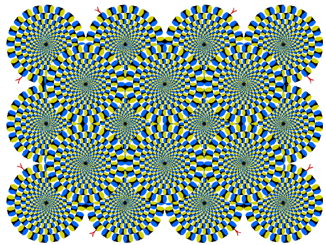
Besides making animated gifs I have also be very fascinated with peripheral vision and the tricks it can play on you.
the picture below is not animated at all, but appears to move as you look at it. don't believe me? print it out on paper, it'll still appear to move.
http://youtu.be/CcXXQ6GCUb8
Using the idea that peripheral vision is very sensitive to movement, I made another header for sparkle king, this time making only small animations appear in the logos tie and squeegee, they pop up every 6 seconds or so.

Having movement on a webpage, even if it's only a small movement, makes the page more alive, less like a printed page in a solid medium, and uses more of the capacities that a web page format allows.
One page that uses movement better then any other page I have seen is the new Nike Air Jordan page. scroll on through it and see what I mean.

